CommunityShield
ML-powered crime pattern explorer for Chicago. 8.5M rows, 4 XGBoost models with SHAP explanations, beat-level heatmap, and an honest methodology page about what the data can and cannot tell you.
Screenshots
A tour through the heatmap, beat detail, prediction view, methodology dashboard, and mobile experience. Every screenshot is from the running app: no mockups.
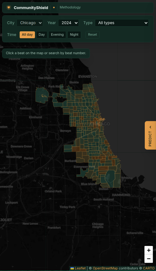
Citywide heatmap
The landing surface. All 274 Chicago police beats colored by recent crime density, rendered through MapLibre GL with a 3-tier fallback strategy so the page works even when WebGL is disabled. Filters at the top adjust the time window and crime category; the heatmap recomputes from the pre-aggregated rollup tables in under 100ms.
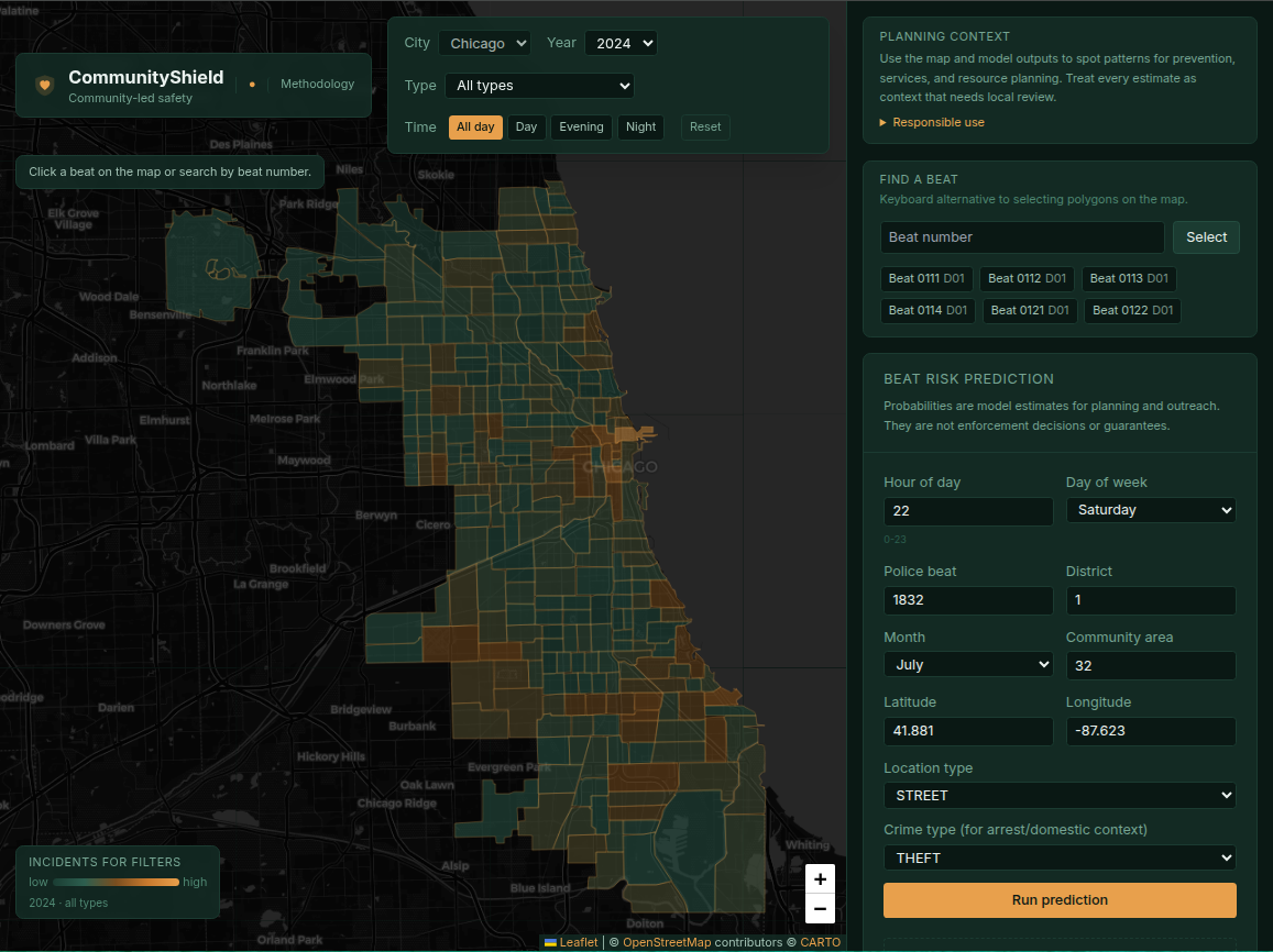
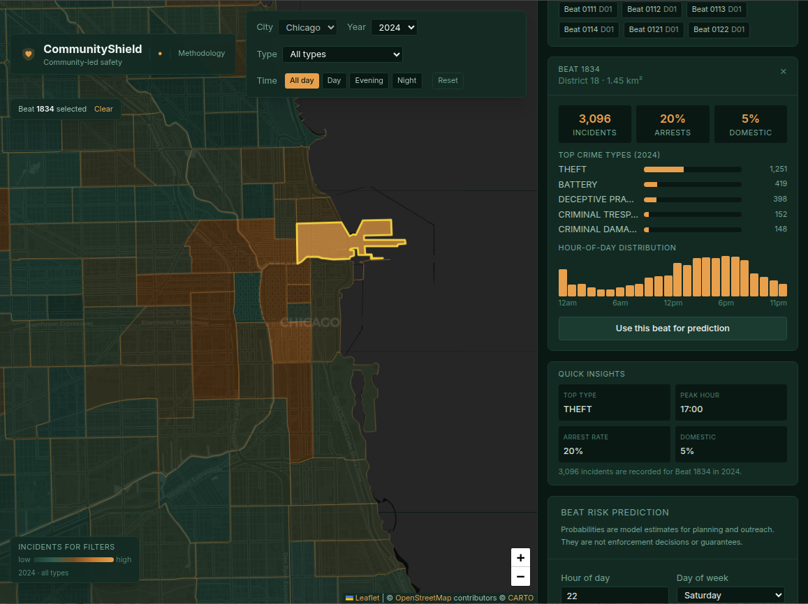
Beat detail
Click any beat to drill in. Per-beat trend chart over the selected window, top crime categories ranked by frequency, recent incident timeline, and a comparison to the citywide median so residents can see how their beat tracks against the rest of the city.
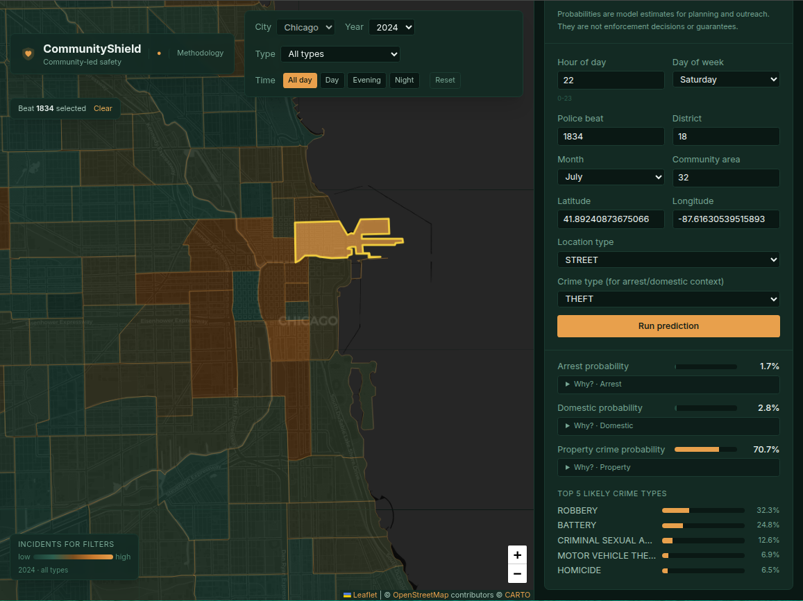
Prediction view with SHAP
The model's prediction for the next reporting window at the current beat, with the SHAP attribution breakdown showing which features moved the prediction up or down. Every prediction is explainable: no black-box outputs.
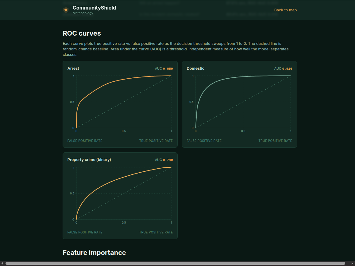
Methodology: ROC curves
The ethics and methodology section is a first-class part of the product, not a buried footer link. The ROC curves for all four classifiers are shown side-by-side, with AUC values and the operating point used in production marked on each curve.
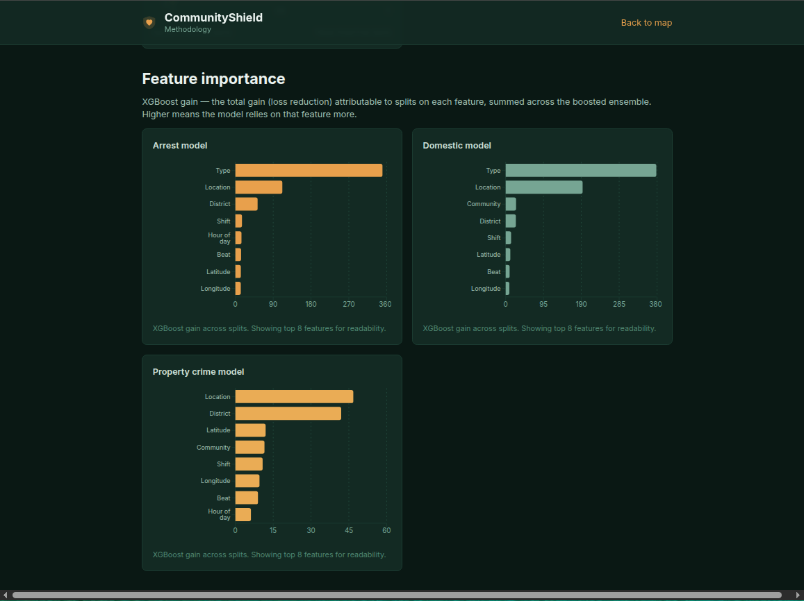
Methodology: feature importance
Global feature importance across the model ensemble. Temporal features (hour of day, day of week) and beat-level historical aggregates dominate, which matches what an experienced crime analyst would expect, and surfaces the data ceiling finding documented in ml-deep-dive.md.
Mobile responsive
Full mobile experience. The map collapses to a touchable beat selector, the trend chart adapts to portrait orientation, and the SHAP breakdown stacks vertically.